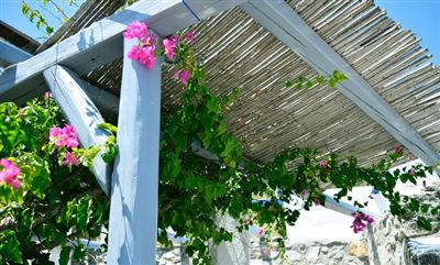
In interior design, the composition of colors and the matching of scenery are very important. The good or bad use of color will produce different stimuli to people's emotions and mood, and affect their work and quality of life. In addition, color can also change the sense of space in the room and create a different mood of the interior space environment. This color design occupies a very special position in the entire interior design.
1. The expression of interior design
Usually when analyzing color, three attributes of color will come to mind. That is, hue, brightness and saturation, which are called the three elements of color, and the physical attributes of color are more used in architectural design, which are mainly manifested in the following aspects.
1.1. Analysis of different building functions
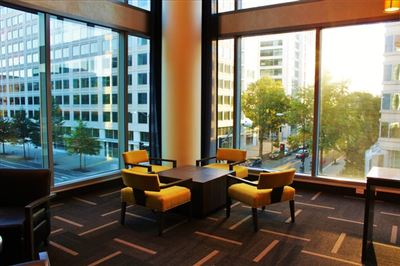
Colors with different color temperatures should be used, and warm colors should be used in leisure spaces such as bedrooms and living rooms to create a warm and comfortable feeling. In offices, meeting rooms and other cities, cool colors are often used to give people a sober and quiet feeling. This is the temperature attribute of the use of colors.
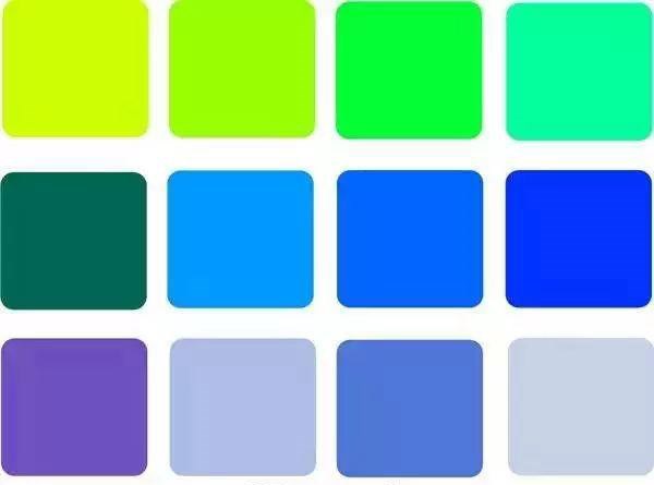
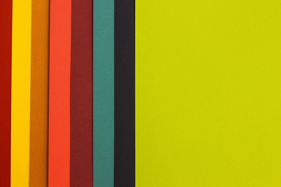
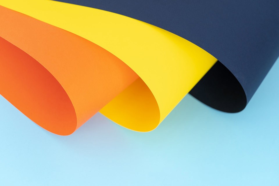
Generally, red and orange colors are classified as warm colors, and cyan and blue colors are classified as cool colors, while black, white, and gray are called neutral colors, and neutral colors can also play a role in harmony.
1.2. From the different color perception. Analysis

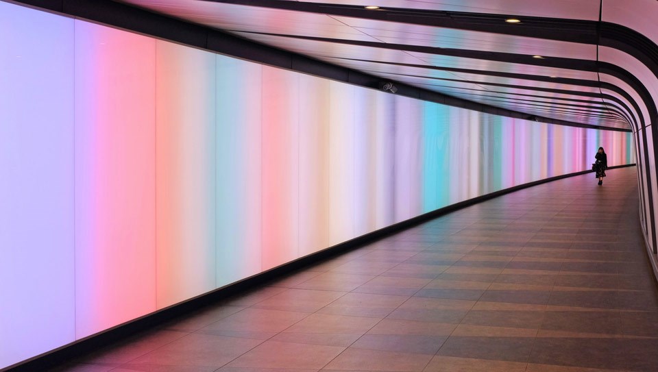
When we see red, we will have a feeling of approaching, and when we see blue, we will have a feeling of retreat. This is because different colors can produce different sense of distance, so cool or bright colors are often used to expand in architectural design. In a small space, warm and dark colors are used to shrink a larger space, which creates a visual change in distance.
1.3. Analyze from the visual effect
Color also has the physical attributes of volume and weight, which can be used to balance the structural defects of the building and cater to people's psychological needs. In order to satisfy the principle of the stability of the architectural space, the commonly used principle is top lighter and lower weight when performing interior design color matching. In the lobby design, thicker load-bearing columns are covered with colors with a strong sense of contraction, and sometimes thin columns are decorated with colors with a sense of expansion.
1.4. Analysis from the brightness and saturation
The interior will give people a light feeling, and this kind of color has a more diffuse effect, so this color has the feeling of volume expansion and light weight. On the other hand, cool colors with lower brightness, lightness, and intensity have a feeling of shrinkage, and at the same time they appear thicker.
2. The relationship between various colors
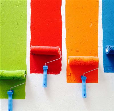
Whether indoor color design can achieve satisfactory results depends on whether it can correctly handle the relationship between various colors. The most critical issue is to solve the problem of coordination and contrast.
Color coordination can create a peaceful and stable atmosphere, but too much emphasis on coordination may appear dull, dull and lifeless. The contrast of colors can make the indoor atmosphere lively and lively, but excessive contrast will make the indoor atmosphere destabilize and produce strong stimulation. The general principle of dealing with indoor color relations is "large blending, small contrast". That is to say, the coordination between the large color blocks should be emphasized, and the small color blocks and the large color blocks should be compared, or in the general trend, coordination should be emphasized, and the contrast should be emphasized.
2.1. Color coordination
Including the coordination of harmonic colors, the coordination of contrasting colors, and the coordination of achromatic and colorful colors. The harmonization of harmonic colors, which includes simple colors, similar colors, and similar colors.
2.2. Coordination of contrasting colors
Contrast colors are the opposite of cold and warm. The contrast is strong, and it is easy to form a sharp, strong, and jumping character, which can enhance the expressiveness and sense of movement of objects and the environment. The purpose of processing color relations with contrasting colors is generally to achieve the following intent.
First, render the indoor environment and pursue a warm, jumping and even grotesque atmosphere;
Second, improve people's attention, make the color parts conspicuous, and give people a deep impression;
Third, highlight a certain part, emphasizing the relationship between background and focus. Contrast colors are mutually exclusive. When the area of the color block is large, the color brightness and purity are high, and there are too many groups of contrast colors, it is prone to excessive stimulation. This phenomenon should be avoided.
2.3. Color contrast
Contrast colors are two colors that are opposite each other on the color circle. They are characterized by a strong contrast between cold and warm, and a visual sense of jumping. Contrast colors are red and green, red orange and blue green, orange blue, yellow orange and blue purple, yellow green and red purple, yellow purple.
Contrast colors are generally used in warm occasions, such as dance halls, playgrounds, etc., which require an atmosphere of jumping and activity. It is generally not suitable to use strong contrast in the living room, but there are exceptions in some occasions. For example, many young people like lively and cheerful colors, so their living room or bedroom can be used. Children are innocent and lively, love sports, and like bright colors. Contrasting colors can also be used in their bedrooms. Contrasting colors are repulsive, and too much use can produce unbearable results. Therefore, use them with caution in interior design houses.
2.4. Coordination of achromatic and colorful
Black and white are the extreme colors of colors. The former is deep and solemn, and the latter is bright and pure, and has been widely used in interior color design. Between black and white, it is a medium gray with a very wide range of brightness. It has no hue and chroma. When it is arranged with colors, it can show differences without being mutually exclusive, and has a great easy-going nature. The achromatic system composed of black, white, and gray is very easy to coordinate with the colored system. In particular, white and grays of various brightnesses are widely used in interior design because they can well play the role of transition and neutralization.
3. The problem of interior color design
The constituent elements of the interior space are also the object of interior color design. Furnishings, ornaments, fabrics, and the color selection of each interface in the room are all the contents of the interior color design.
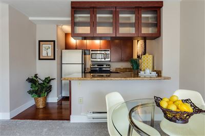
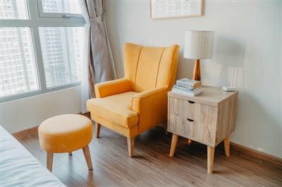
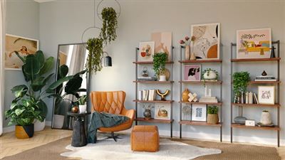
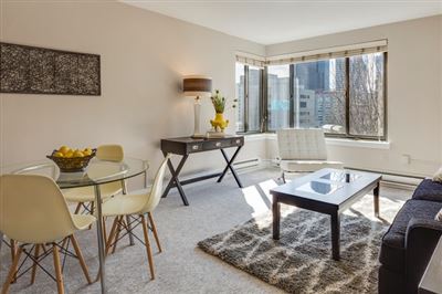
3.1. Furniture color
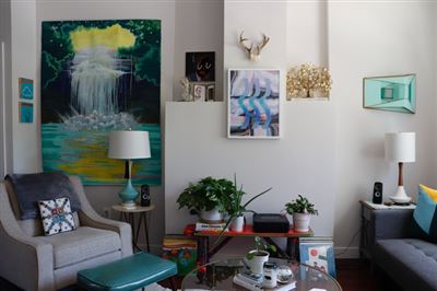
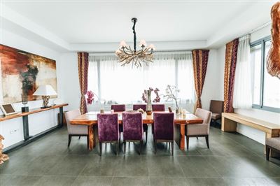
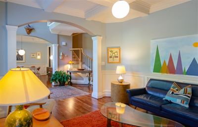
In the indoor environment, furniture has both practical and decorative functions. In modern interior design, due to the large scale of the room, furniture is more regarded as furnishings in the space. It is treated as a three-dimensional element in the shape and has great independence. Therefore, old-style furniture mostly adopts strong tones, engraved and painted. In modern indoor space, furniture is a large object in furnishings, and its color often becomes the color tone of the entire indoor environment. Therefore, the color selection of indoor furniture should be based on our consideration of the overall color style of the room. A certain indoor color tone corresponds to a certain indoor environment atmosphere. We should determine the unique style according to the nature of the designed interior space, and then choose the color of the furniture according to this style. The light-colored furniture is full of vigor, the dark-colored furniture is solemn, the gray-toned furniture is soft and elegant, and the appropriate combination of multiple colors is vivid and lively. When the inner space is large, a small amount of dark furniture can be carefully set up, and the proper use can effectively create a solemn atmosphere, which fully reflects the level of the space and the master's self-cultivation. In children's rooms, color series furniture can be considered, which is beneficial to the development of children's personality.
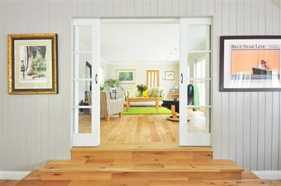
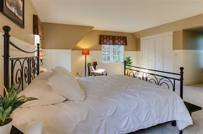
3.2. Wall color
The wall plays the role of set off in the indoor environment. It is suitable to use light and elegant colors, and the four walls should preferably be the same color. The color matching should focus on the coordination and contrast with the color of the furniture. For light-colored furniture, the wall should adopt a similar tone or color as the furniture: For dark-colored furniture, the wall should use a light gray tone. In a large space, a wall can also be treated as dark or colored, but the integrity of the wall must be ensured. At this time, the wall should be closer to a mural in nature. In addition, the choice of wall color should also consider the impact of environmental tones. For example, in the south-facing room, due to the effect of sunlight, neutral and colder walls should be used to prevent people from feeling hot. Such colors include gray-green, light blue-grey, light yellow-green, etc. The same north-facing room should choose a warmer color, such as cream yellow, beige, etc.
3.3. Ground color
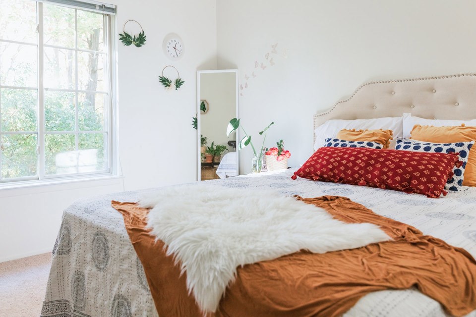
The ground usually adopts a color that is similar to the color of the furniture or wall but has a lower brightness, which will give a sense of stability. But in a small room, the dark floor will make the room appear smaller. At this time, pay attention to make the color of the entire room have a higher brightness. For example, in the indoor space of the bedroom and the living room, light-colored and soft floor materials should be used.
3.4. The color of other items
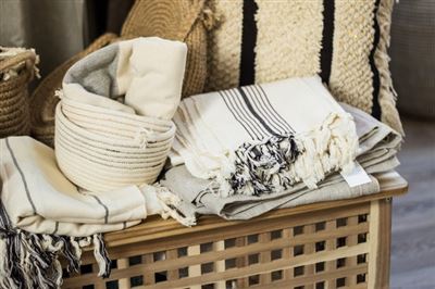
The colors of curtains, bedspreads, sofas and other items are also an integral part of the overall color of the room, and should be consistent with the overall color of the room, especially the materials used in large areas.
Most of the small objects encountered in interior design are textiles. It is usually recommended to choose the same color and texture, and use light and neutral colors as the best strategy. Light and crisp fabrics can be brighter in color and use smaller materials. Yes, but a neutral gray tone should be used for thick fabrics, and the size should be larger. In this way, the wrinkles formed by the natural sagging of the cloth will produce a luxurious effect. Integrity is the foundation of all personalities. Therefore, the fundamental point of color design is how to obtain the integrity of indoor color, that is, the balance and uniformity of indoor color environment.